
|
image
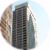
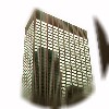
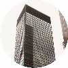
THE 100 PARK AVENUE
[Kahn & Jacobs]
|
was built in 1948-1949 as the first large commercial skyscraper in
post-war NYC.
The new building replaced the Murray Hill Hotel (1883), but only
after the hotel residents' resistance had led to delays and lengthy
court battles.
The 36-storey building is built on an L-shaped plot, with the wing
stepping back on the 40th Street side and the main mass rising on
Park Avenue. Above the base, the tower rises to a set-back top
with illuminated numbers indicating the building's street number.
The facade has piers of white brick, with vertical stripes of glass
and aluminium spandrels between.
The most notable feature of the building was its bulk, exemplified
by the 2,790 m² floors of the 13-storey base, enabled by the
introduction of effective illumination and air-conditioning for the
deep interiors of the large base. The massing resulted in a total
interior space of 76,700 m².
As a large speculative office tower that maximized the built space
for its plot, the 100 set the trend for International Style
construction in the following decades.
|


image
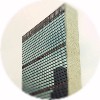
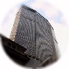
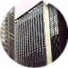
THE UNITED NATIONS SECRETARIAT
(First Ave. / E 42nd St.)
[United Nations Board of Design, headed by Wallace K. Harrison,
overall composition by Le Corbusier]
|
is the most prominent member of the United Nations Organization (first
assembly in 1946) building complex on an 18-acre site stretching along
the East River from 42nd to 48th Streets.
The organization had been searching for a site to locate to, and when
developer William Zeckendorf's plans for the so-called "X City" to
these East River blocks he had collected fell through, the site was
proposed as a home for the U.N.. As the city was unable to purchase the
site itself, John D. Rockefeller, Jr. bought the land for the complex
for $8.5 million and donated it to the city in December 1945.
An international committee of architects, called the United Nations
Board of Design, was assembled in 1947 and consisted of ten architects
(including Brazilian Oscar Niemeyer and Swede Sven
Markelius) and was assisted by numerous consultants. Work on the
plans was started in January 1947.
Of individual architects' proposals, that by Le Corbusier,
representing France, was chosen as the basis for further design. His
"scheme 23A" from March 1947 included, among the placement and massing
of the actually completed buildings (like the Secretariat as a
high-rise slab), also an (unrealized) east-west slab on the north end
of the site.
Razing of the site was begun in July 1947 and ground for the
Secretariat building broken on September 14, 1948. The cornerstone was
laid on October 24, 1949 and the Secretariat was completed in spring
1950. The whole complex was ready by 1952.
Despite the strong criticism against its scale (as opposed to General
Assembly and Conference buildings) and its interior design, the
39-storey, 154 m tall Secretariat building was nevertheless an
impressive modernist landmark, and it influenced commercial building
for years after its completion.
The east and west facades' blue-green-toned Thermopane windows were
chosen because they lessened the heating effect of the sun, thus
reducing the need for a more effective
air-conditioning. The curtain
wall of the building is truly all-glass, as also the spandrels between
the window rows of the floors are of glass, only painted black on the
inside surface. Although Le Corbusier opposed this arrangement and
wanted to use normally opening windows along with brise soleil
awnings as a guard against sunheat -- related to the fixed metal rod
screens that have become so commonplace in the 1990s -- the curtain
wall was to epitomize the whole skyscraper design from that point on.
The windowless north and south ends of the Secretariat are clad in
marble plates from Vermont.
The glass walls are interrupted by air-conditioning intake grilles on
6th, 16th, 28th and 39th floors, extending the whole width of the
facade (image). The
structural columns form 28 feet (8.5 meters) wide bays along the outer
wall and the glass walls are cantilevered 0.8 meters from the column
line to enable an uninterrupted curtain wall.
On the 38th floor of the building are the UN Secretary General's
offices. At the top is a high aluminium grille to conceal the
equipment on the roof.
Bronze sculpture Single Form (1962-63) by Barbara Hepworth
stands outside the Secretariat.
The United Nations is seeking ways to make extensive repairs and
updates to the building that is plagued by asbestos, lead paint and
concrete falling off, as well as inefficient ventilation and windows
and a lack of fire sprinklers. Renovation could last until 2012, cost
$1 billion and possibly require the construction of a
new office tower to the south of 42nd
Street to house the Secretariat's activities in the meantime.
|
Elevation drawing
Great Buildings Collection entry


image
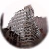
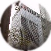
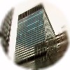
THE LOOK BUILDING
(488 Madison Ave.)
[Emery Roth & Sons]
|
was built in 1949-1950 for the Look Magazine to the north of St.
Patrick's Cathedral in Midtown.
The magazine's building was begun two years after the Best & Company
high-rise department store on the western blockend (later to be
replaced by the Olympic Tower) started
the post-war construction on Fifth Avenue. The Look Building was a
similar catalyst on the Madison side, replacing St. Patrick's
Cathedral College (1893).
The 23-storey building's steel frame (built in only 12 weeks of
hectic work) enables the facades to have full strip windows with
narrow mullions, wrapping continuously around the three facades,
forming alternating bands with the white brick spandrels. All the
corners of the building are
rounded up to the water tower enclosing at the top at 93 meters,
doubling its form on the Madison Avenue facade upper floors. Above
the first setback, the symmetrical sidestreet facades even curve
within themself to form a west wing set back from the street line.
|
The
Cityreview entry


image
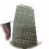
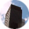
THE 1407 BROADWAY
[Kahn & Jacobs]
|
was completed in 1950 to the Garment District for the use of clothing
companies.
The full-block site had been acquired as early as in the early 1940s,
but the construction on the already-excavated site could get underway
only after the war.
The 42-storey building has a massing that rises as a set-back
full-block portion to half the total height and the unsetback tower
rises to 156 meters on the eastern end of the block. The building is
orientated along the north-south street grid, with the diagonal direction
on the Broadway side followed by the massing of the wings.
The building is clad in green-hued brick and the strip windows have
mullions painted in bright red.
For the use of its industrial tenants, the building was also equipped
for off-street loading and unloading of trucks.
|


image
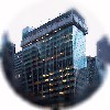
THE KENT BUILDING
(161 E 42nd St./666 Third Ave.)
[Reinhard, Hofmeister & Walquist]
|
was completed in 1952 to the eastern blockfront of the block
better known as the location for the Chrysler
Building.
Announced in 1949, the building was, imaginatively, called the
Chrysler Building East. Despite having its main entrance on Third
Avenue side, the address was given as a 42nd Street one -- due to the
then-seedier nature of the avenue. With the demolition of the
disturbing Third Ave. Elevated Railway in 1956 -- which started a
general development boom on the avenue -- the address was accordingly
changed to 666 Third Avenue.
The 32-storey building rises set-back from a block-wide base
with a ground floor of black granite. Originally clad in white brick,
the uniform window openings on the slab-form tower changed into
continuous vertical striping for the top floors.
The Chryslers occupied the ends of the blocks, but the properties
between remained in other hands, so an underground connection was
dug to connect the two buildings.
After the Tishman Speyer Properties bought both the buildings, as
well as the intervening low-rises, in 1998, Philip Johnson was
brought in to renovate the East Building, as it was to be called.
Not only was the building clad in a dark blue curtain wall, but the
interior arrangement was also changed radically. A 13,500 m²
addition to the western side changed the building from one with
elevators located to one side to a center core building.
The new Chrysler Center incorporates all the buildings on the southern
blockfront facing 42nd Street,with a new Johnson-designed lobby
connecting the structures.
In May 2001, the Chrysler Trylons, a Philip Johnson-designed
pyramidal extravaganza of blue-grey glass was completed between the
two Chrysler Buildings. The three different three-sided pyramids
(consisting of 535 panes of glass) cover a, yes, three-level space,
planned for retail and restaurant uses.
In 2002, Tishman Speyer sold its 75 percent stake in the building
for $224 million for the German Commerz Leasing und Immobilien.
|
The Cityreview Chrysler Building entry


image
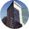
THE LEVER BUILDING (390 Park Ave.)
[Skidmore, Owings & Merrill,
Gordon Bunshaft as chief designer]
|
was, along with the UN Secretariat, a building that
set new standards for skyscraper design when built for the Lever
Brothers Company in 1952.
Although originally planned to be built in Chicago, Lever brothers
chose to relocate to New York City for advertising reasons. SOM, the
designers of the new Lever headquarters, were spurred by the company
president Charles Luckman, also an architect, to design along modern
and "American" lines. (Luckman returned to architecture after his
precidency was over, and in fact worked as a partner with Pereira &
Luckman to design the first proposal for the cross-corner
Seagram Building in 1954.)
This 24-storey building replaced the heavy (and heavy-looking as well)
masonry walls of the contemporary skyscrapers with mere green-tinted
glass curtains and stainless steel sheathing. Although the building was
also criticized for its appearance amidst the old masonry apartment
houses, it was nevertheless usually taken with enthusiasm as a pioneer
of the new style.
The building was also revolutionary in being the first skyscraper to
utilize the clause in city zoning
regulations that allowed a building to rise straight up without
setbacks if it occupied only a quarter of the plot. It houses 26,000
m² of total space, of which 13,900 is for offices. Notable was
also the fact that the building was planned from the outset to be
occupied merely by the owner, Lever Brothers Co., rather than letting
part of the building to outside clients. Unilever has since almost
vacated the building, occupying today only the four top floors of the
building, with the rest available for renting.
The basement houses a 63-car garage, the only portion of the building
utilizing the whole plot area -- the area used by the office tower
would, in fact, cover the plot with a mass only eight-storey tall.
On the street level there is a garden atrium, separated from the street
by metal-sheathed columns carrying the low "perimeter" base of the
building. Landscape designer Isamu Noguchi planned a 14-piece sculpture
garden to the atrium space, but the plan was eventually not carried out
(image)
(the garden was finally added in 2002 in a design by landscape architect
Ken Smith, following the overall style of Noguchi's design
(image)).
The top of the low horizontal base also functions as an outside
"elevated" plaza, accessible from the employee cafeteria at the base of
the tower.
The vertical main mass of the building raises on columns from the base
and is positioned at right angles to Park Avenue, with the wider
portion of the tower slab facing south. The tower is set back 30 m from
the south building line and 13 m from the north, giving the office
premises an unprecedented amount of light and air. It was also the
first fully climate-controlled, fixed-windowed office building in NYC.
The top three floors, distinguishable on the facade, house technical
installations and machinery.
A movable scaffolding was developed especially for the cleaning of the
tower's glass walls. The crane unit moves around the perimeter of the
flat roof on rails and supports the scaffold. In accordance with the
owner, the detergent used in cleaning the windows came from the Lever
line of products -- the first product used was Lever's "Handy
Andy"...
The extensive interior design of the building was trusted to Raymond
Loewy, who was to become one of the most iconic figures in the
profession.
In late 1998, the new leasehold owner of the building, RFR Holdings,
was negotiating a 99-year ground lease extension for the building. Also
the possibility of an addition has been mentioned as there is still
22,300 m² of unused development rights available.
In November 1999, a $10.7 million contract for renovation of the
building's facade was awarded to Flour City International, Inc.. The
renovation will be designed by Skidmore, Owings & Merrill and
supervised by the NYC Historical Society.
Along with the aforementioned sculpture garden addition and previous
renovations worth $40 million, RFR is adding a restaurant to the
ground floor. The 420 m² restaurant is designed by Marc
Newson and will have entrances from both the lobby and 53rd
Street.
|
The Cityreview
entry
Great Buildings Collection entry |
images


image
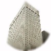
THE MANUFACTURERS HANOVER TRUST BUILDING
(350 Park Ave.)
[Emery Roth & Sons]
|
was built in 1954 for the Manufacturers Hanover Trust Company
and was the first building to apply the glass walls of International Style
to bank design.
The facade is, similarly to the Lever Building's, characterized by the
horizontal window stripes and vertical top pattern, but the form of the
building differs notably from its predecessor. The lower portion of the
building occupies the whole building lot and halfway up the building
there are series of setbacks before the upper portion rises vertically to the top.
|


image
THE SOCONY-MOBIL BUILDING (150 E 42nd St.)
[Harrison & Abramovitz and John B. Peterkin]
|
was built in 1956 opposite the Chrysler
Building as the headquarters for the multinational oil company.
Announced in 1953, the building was the largest office development in
NYC since Rockefeller Center: it housed 120,800 m² of space, of
which 46,500 was occupied by Socony-Mobil (until 1955 called
Socony-Vacuum).
At the time of its completion, it was also both the largest centrally
air-conditioned commercial building and the largest metal-clad office
building in the world.
The 45-storey building has a simple slab form, rising to the height of
174.5 m, set back from the street by lower-floor extensions.
Although originally planned as brick-clad, the facade material was
changed to aluminium and eventually to stainless steel in 7,000 panels
with a three-dimensional treatment that gives the facade a "rusticated"
effect, similarly to the same architects' Alcoa Building in Pittsburgh
two years earlier, or the later Tishman
Building in NYC. In addition to its aesthetic
role and the developers' aspiration for a long-lasting facade treatment,
the patterning has also a practical function: it prevents the facade
plating from bending.
The building is set on a three-storey base clad in blue glass, with
retail spaces and through-building arcades. The lobby is vaulted,
reflecting the arched entrances, and has white marble and terrazzo
decor.
After Mobil moved its operations to Virginia in 1987, the Hiro Real
Estate Company obtained the operating lease, having also given the
building a $15 million renovation.
|


image
THE TISHMAN BUILDING (666 Fifth Ave.)
[Carson, Lundin & Shaw]
|
was completed in 1957 as an office tower on 53rd Street, across the
street from St. Thomas's Church.
Architects Carson & Lundin were hired to bring the building such
Rockefeller Center-like appearance that their Esso (later
Time Warner) Building presented. In the
course of the design work, the stone cladding was, however, changed to
patterned aluminium plating, resulting in the largest aluminium-clad
building in NYC so far.
The 30-storey main slab rises from a nine-storey base and there is
115,700 m² of office space inside the building. The building is
illuminated at night by floodlights and the illuminated 3.5-meter
numbers "666" adorn the top. (In 2002, the numbers were replaced by
a blue and red Citigroup logo on three facades.)
The entrance from Fifth Avenue is through two recessed gateways,
flanked by retail spaces and sturdy black columns. The entrance lobby
is lined in red limestone from Southern France. Isamu Noguchi designed
the lobby ceilings and the waterfall adorning the outside gateways by
using bent metal profiles -- illuminated for added effect -- as
decoration (image). Also the patterned marble floors in the
lobby are his handiwork.
The top of the building housed the appropriately named restaurant The
Top of the Sixes, affording a view over Midtown, before it was closed
in 1996. The restaurant had decor by Raymond Loewy.
Renovated in 1998 under its Japanese owners, Sumitomo Realty and
Development (1987, $530 million), Nobutaka Ashihara Associates
re-designed the retail spaces and arcade as an expanded, glass-walled
entity. The Alitalia airline ticket office by Gio Ponti had
been closed a year earlier. Also the top-floor restaurant space was
converted into the Grand Havana club.
The original developer firm (in its 1990s form), Tishman Speyer,
co-re-obtained the building in 2000 with the German investment group
TMW. In 2001 they set to modify the Fifth Avenue street-level frontage
by replacing the mid-facade entrance with retail space. The loss of
the entrance will be offset by enlarging the 52nd Street entrance
and expanding the lobby. Also the interior of the lobby will be
restored to its original form.
In 2002, the building was put on sale, hoping to fetch up to $900
million.
|
The Cityreview
entry


image
THE 1065 SIXTH AVENUE
[Sydney Goldstone with Kahn & Jacobs]
|
was built in 1955-1957 as an office building to the west of
Bryant Park in Midtown.
The 38-storey, 137-meter building was built on an L-shaped plot, with
the building wrapped around the north-eastern corner plot of the
blockend. The tower on the southern wing is set back progressively
from 40th Street and Sixth Avenue as it rises.
The elevator banks on the building are offset to the west wall,
freeing other floor space for offices, with 61,780 m² of total
space available. The lobby has entrances from both 40th and 41st
Streets.
Renovated in 1993, the building was acquired in 1997 by TrizecHahn
Properties, along with the nearby W. R. Grace
Building.
|


image
THE SEAGRAM BUILDING (375 Park Ave.)
[Ludwig Mies van der Rohe, Philip Johnson and Kahn & Jacobs]
|
was completed in 1958 for the Seagram's distillery company and was
immediately hailed with critical acclaim.
The Seagram Building would've turned out very different if not for
Seagram president Bronfman's daughter, herself also an architect, who
persuaded her father to hire an architect of world renown and with new
ideas. Out of numerous modern masters (Le Corbusier ruled out as "bad
influence", Lloyd Wright for his "frontier mentality"), she picked
German expatriate Mies van der Rohe, then teaching in Chicago, to
design the building.
This 160 m tall building was a further development of Mies's ideas from
the 1951 Lake Shore Drive Apartments in Chicago. Working with
architect Philip Johnson (who did the interior design of the
74,300 m² building and eventually had also his offices on the 37th
floor of the building), Mies started on the design work in 1954.
The plot acquired for the building was on the block earmarked in 1954
for the new Metropolitan Opera development -- eventually the opera
was built as a part of the Lincoln Center
(image) compound
in Upper West Side. The building permit was granted on March 1955 and
the building was officially opened on 22 May 1958.
The building is placed to the "rear" portion of the end-of-block site,
off the Park Avenue, with no less than one third of the $5 million plot
consisting of a stepped-up, pink travertine-clad open plaza with twin
fountain pools flanked by trees. The plaza offers no seating and, in
fact, Mies wanted the pools to be filled to the brim to prevent people
from even sitting on their edge. (Another feature of the building that
Mies designed to prevent the inevitable "meddling" of human beings
was the omission of window sills and supplying of similar curtains and
venetian blinds -- moveable to only three positions -- to every window
so that the harmony of curtain wall is retained as much as possible.
If only others would be that dictatorial...)
The plan of the building is based on a 8.50 m grid, pursued to
unprecedented Miesian accuracy. The elevator core is placed to the back
of the building, forming the protruding, windowless back wall of the
tower. And because the building preceded the legislation of
plaza bonuses (only coming to force
as a law in December 1961), its bulk was made possible by using only
a quarter of the plot for the tower footprint, thus giving it unlimited
height as per the 1916 zoning.
Set on bronze-clad pillars, the 38-storey facade consists of
alternating bands of bronze plating and "whisky brown"-tinted glass
(the material and colour choices were a result of Bronfman's insistance
of having a warmer-toned facade than in the Lake Shore Drive Apts).
The building was, notably, the first with floor-to-ceiling windows,
making the wall a true curtain of glass, as foreseen by the visionaries
of Modern Movement, like Mies himself. Between the
windows, there are vertical decorative bronze I-profiled beams attached
to the mullions to emphasize the vertical rise of the facade. Van der
Rohe personally stated that this was his only building in the United
States which met exactly his European standards.
Due to the material choices and custom-made details (largely designed
by Philip Johnson) the building became -- per built square meter -- the
most expensive skyscraper ever; it cost $36 million, approximately
twice as much as normally. In this lavish expenditure, along with the
"wasting" of rentable (and thus, taxable) space by providing a large,
unbuilt open plaza, lay also the seed for financial loss: the city
officials deemed the building excessively prestigious as well as losing
the city tax income, and thus imposed on it a taxation value that was
nearly double (per square meter) that of other contemporary skyscrapers
nearby.
In 1972 Seagram's moved over half of its staff from the building in
order to cut costs. Four years later the company itself proposed
a landmark status for the building, a request which however was turned
down by the Commission due to the
young age of the building.
Not in all respects were the proceedings with the city officials
failures: the success of the plaza scheme (both as a popular haven and
an exhibition space) led to the revision of the
zoning regulations to encourage other
builders to follow the suit.
The lobby has glass walls with typically "Miesian" thin-framed
mullions. It is an extension of the outside plaza with its similar
stone cladding on floor, as well as on the elevator bank walls. The
ceiling consists of glass tiles. The elevator cars have stainless steel
and brass decor.
The adjoining two-roomed Four Seasons Restaurant has its entrance on
52nd Street. The south dining room has French walnut tree panel decor
as well as two Richard Lippold brass constructions. The north dining
room has landscape decor and a pool in the middle. In the adjoining
corridor hangs Picasso's backdrop for "Le Tricorne" ballet (1929).
The building was acquired in 2000 by RFR Holdings, also the owner of
the nearby Lever Building, for a sum of
$380 million.
|
Elevation
drawing
The Cityreview
entry
Great Buildings Collection entry |
images


|
![]()

![]()
 Skyscrapers after 1945





 © e t dankwa
28 June 2008